Faro
A sexual health app concept designed around the moment that matters most
2026 · UX/UI Designer · Concept project
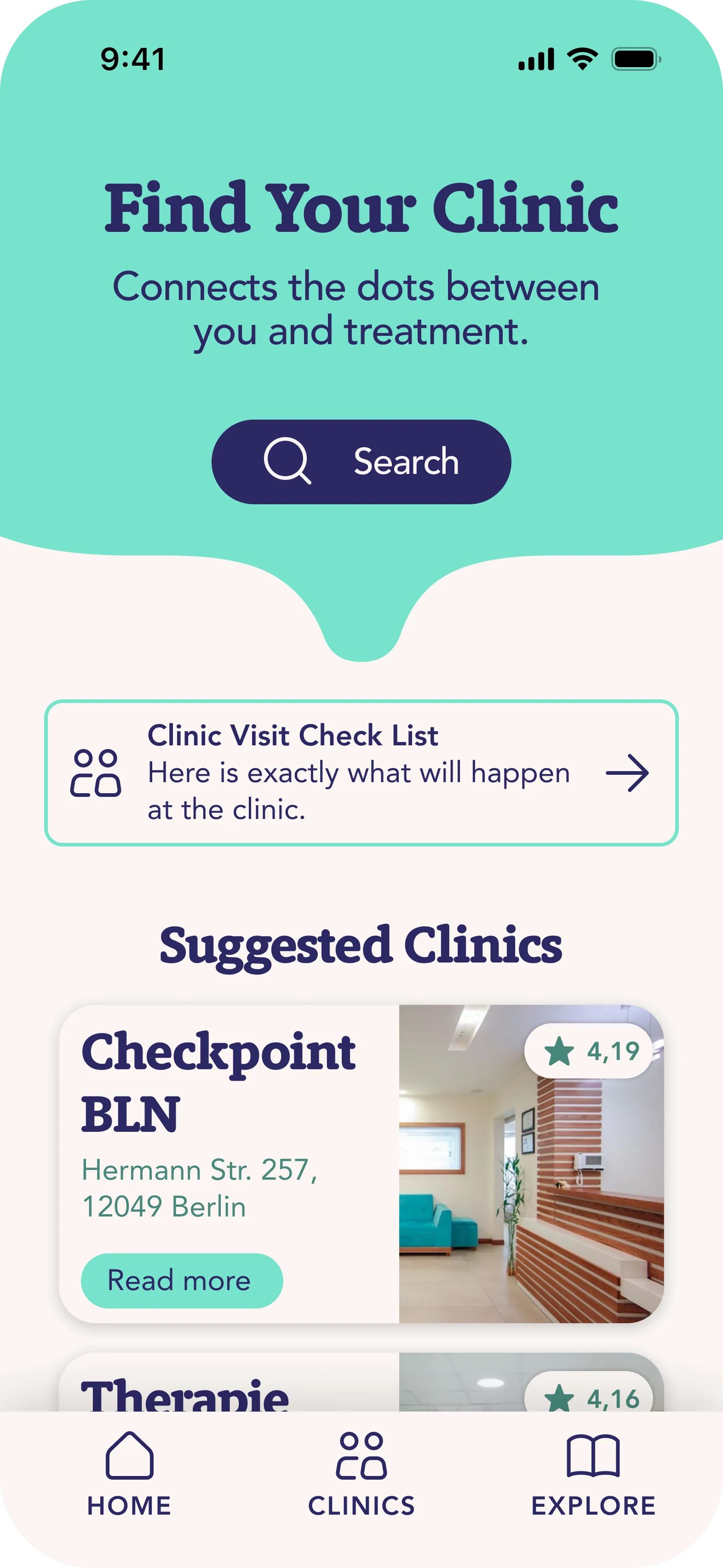
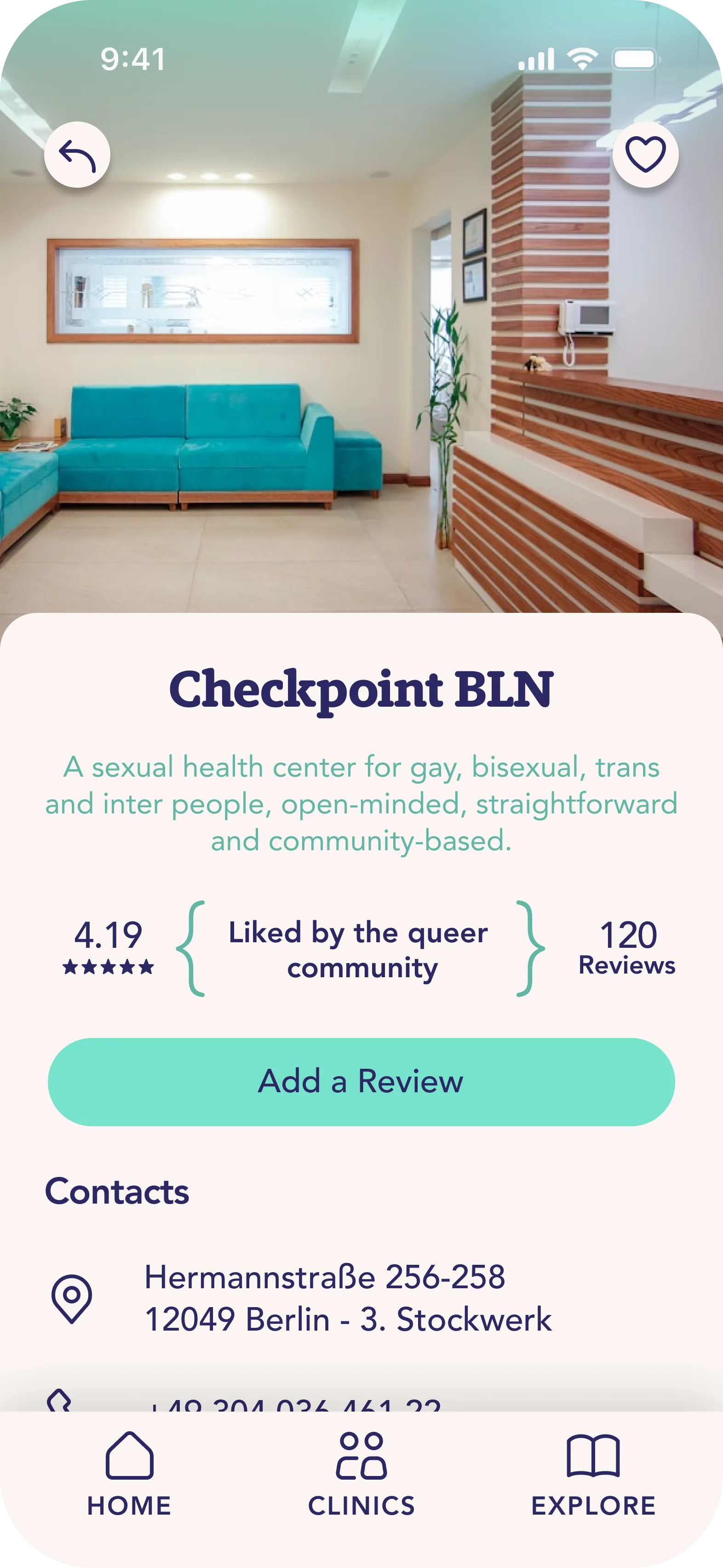
A sexual health awareness app concept focused on one specific moment: when someone needs to find a clinic, testing centre, or support service quickly, without friction, without exposure. Inclusive by design, so the app fits whoever opens it.
Designed in a team of two during the final project of Spiced Academy's UX/UI bootcamp in Berlin. The deliverable is a concept and prototype, not a shipped product.
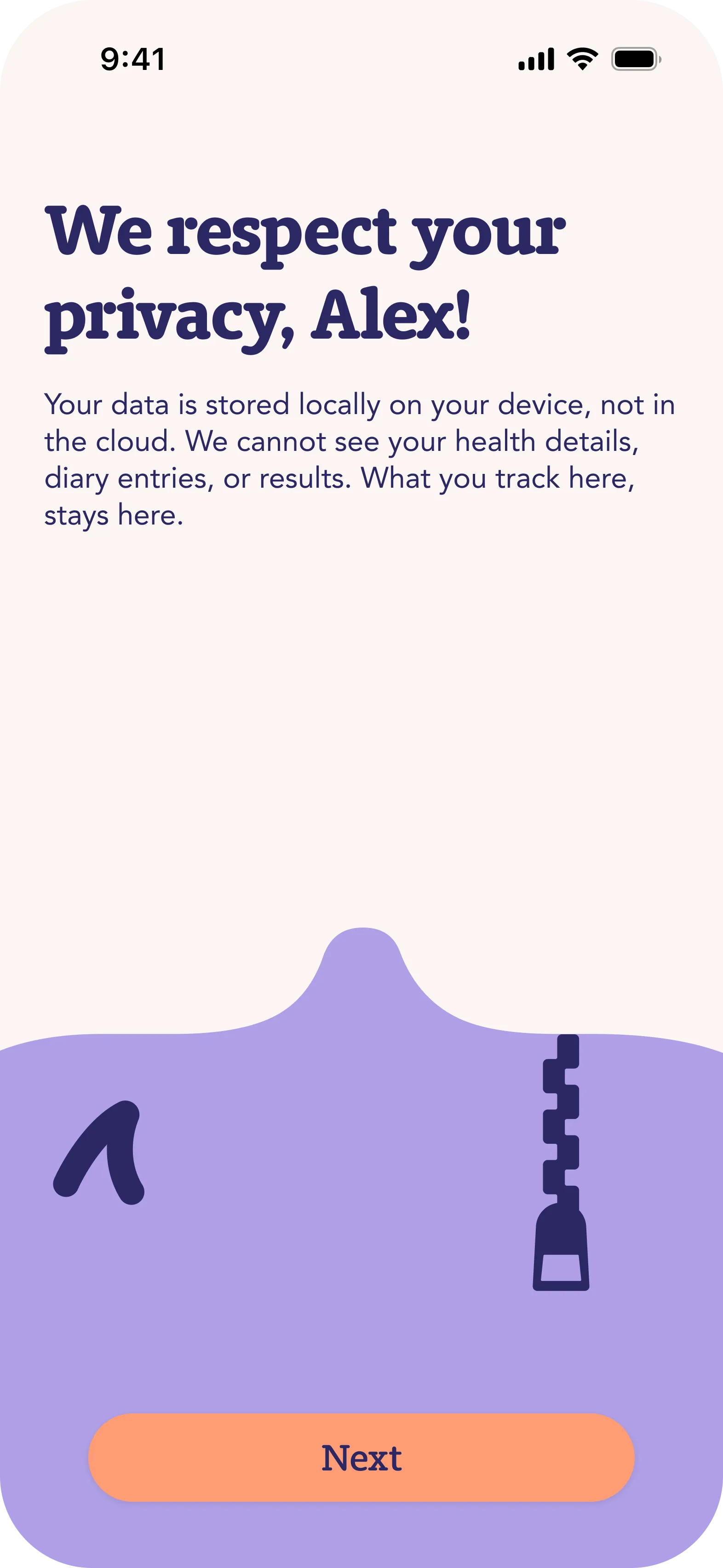
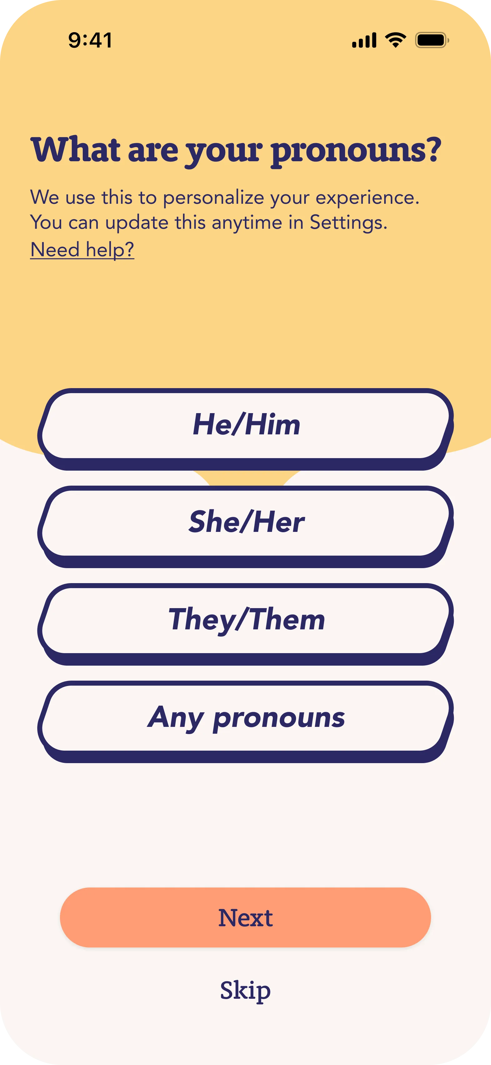
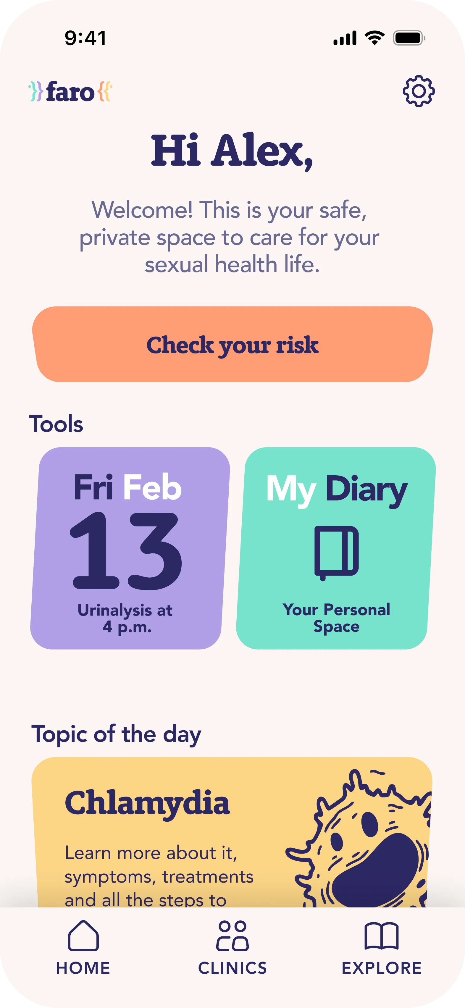
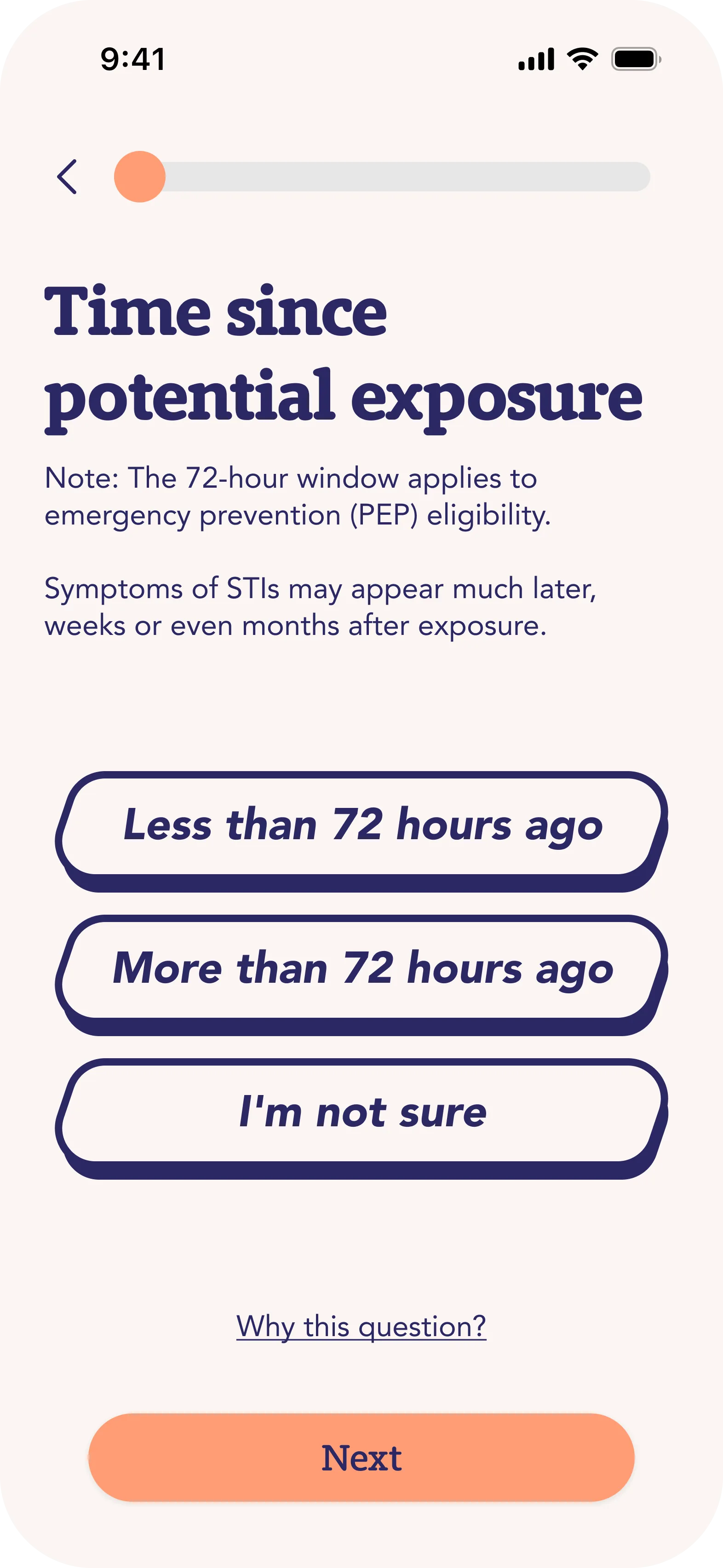
A walk through the key flows: privacy, identity, urgent risk assessment, and finding nearby care.

The problem
User research surfaced something simple and uncomfortable: people who think they may have been exposed to a health risk don't want to navigate a wellness app. They want one thing, "where do I go right now", and they want it without ten taps, without an onboarding flow, and without making it obvious what they're looking at if someone glances at their phone.
Most existing apps in the sexual health space optimise for engagement, education, and community. Important things, but they fail the one moment that matters: the urgent, slightly panicked search for a physical place to go.
We designed Faro for that moment specifically.
Research highlights
Two findings from our user research shaped the entire design:
47% turn to Google first when they have a sexual health question. Doctors and AI tools each capture less than 20%. The first contact is almost always an anonymous, low-friction search.
63% of respondents struggle to find help when they need it. Embarrassment, unclear severity, and not knowing where to go all play a role. The information gap is bigger than the trust gap.
These two numbers framed the brief: build something that wins the search moment, then removes the struggle.
Our principles
Privacy first. Confidential and discreet by default. Users have full control over their data. Visual restraint extends to the app icon and the in-switcher preview, so the app looks unremarkable to anyone glancing at the phone.
Clinical but human. Medical accuracy paired with approachable language. The app speaks like a trusted friend, not a textbook.
Embrace diversity. Language, imagery, and categories don't assume identity, orientation, body, or cultural background. Inclusion is default behavior, not a feature.
What I worked on
The project was a collaboration. Both of us touched design, research, and prototyping. My contribution centred on:
- User research synthesis. Translating interview transcripts into design constraints, particularly around emotional state, privacy concerns, and information hierarchy under stress.
- Information architecture. Deciding what the app shows in the first three seconds versus what gets buried two screens deep.
- Flow design. Mapping the "I might have been exposed" path from app open to clinic information, optimising for the fewest possible decision points.
- Visual design contributions. Working within the brand and palette to keep the tone calm, non-judgmental, and unambiguously inclusive.
Sergio led on illustration and brand identity. The final case study published in his portfolio reflects the team output as a whole.
What I learned
The most important takeaway from this project wasn't about colour, type, or interaction patterns. It was about designing for the emotional state of the user, not the average user.
Interviews made it clear that a sexual health app gets opened in two very different states: curious calm, and urgent worry. The same interface has to serve both, but optimise unambiguously for the second. Once we made that explicit, almost every later design decision had a clear answer.
The other thing I took away: collaborating closely with another designer on the same artefact, in the same week, with overlapping responsibilities, is harder than it looks. We invested time early in defining who owned what, and that investment paid off in every review afterward.
Read the full case study
The complete project case study, including research methodology, wireframes, and final mockups, is published in Sergio De Simone's portfolio:
FARO / Sexual Health App Assistant
Credits
Team project. Designed with Sergio De Simone. Final project for Spiced Academy UX/UI program, Berlin, 2026.